Page by page and letter by letter
...in Germany the question of the design has a long tradition. Just think of the »Werkbund« and »Bauhaus« as well as the Ulm Academy for design; there in the 1960s here the word »design« came into
being - at that time clearly connected with the idea to find a well-thought form for all things, whose beauty has also to do with good functioning - without the guideline »form follows function« as a restricting dogma. Many apparatus of the Braun Compony - starting with kitchen-equipment to hifi-systems and tooth brushes - served
as a model for this line of a functional as well as unpretentious
elegant design.
Irmgard Sonnen, a designer for visual communications who lives in
Düsseldorf, fully agrees with the design theory at that time »less is more«. Her works are obliged to this aim, to achieve the maximum with a minimum. Colour-element-systems for Rheinbahn, projects
for architects and interior designers, the Corporate Design for companies inclusive the design of all publications, the design of catalogues and books: her projects are manifold, her spectre is
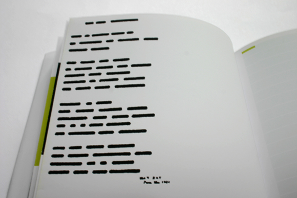
large. One of her book projects is a literary calendar. It combines typographically designed texts from the fields of literature, natural science, philosophy and colloquial language which all deal with the phenomenon of time. So that a »time-book« comes into being -
with enough room on the right pages as to write down personal
items. The title already is a poem: About the poetry of the moment.
A diary for 365 moments.
This calender-diary reflects all virtues of the accredited designer
for visual communications at its best - and they are to be found
in the recently founded Queredo Publishers. There are small editions, of course, both particular and equisite, as just now »Anna Blume ist rot. Colour as event« - a collection of essays up to poems about
their own topic: Colours. Statements of great painters, poetic approaches to the outward form and the atmospheric variety of a colour, all this combines the editor and designer Irmgard Sonnen
in a convincing manner. And she so shows how contexts can be increased if text, typography and graphic-colour construction of
the pages are coordinated in the smallest step.
No wonder that she not only in her own design studio creates high quality form of visual communication but that she, beside this free lance work, has been teaching at the Academy of Aplied Sciences, Düsseldorf since1981. She has, of course, clear imaginations of
ideas of quality, but she gives however enough space for develop-
ment to her students. Success proves her right: many projects and concepts, also incooperation with her professor collegue Dieter
Fuder, come into being. There is no lack in acknowledgement from outside, here to mention several red-dot-awards, the highest international design-award. For her own works and those of her students.
Petra Kammann, InRheinkultur, Journal für Kultur, fall 2007